How to Use the Sorting Labels on Signs
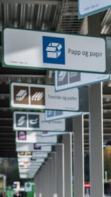
The main rules for using the Sorting Labels also apply to the design of signs. In addition to the requirement for a white border around the Sorting Labels, it is recommended to use black text on a white background for all text on the signs. This provides optimal readability and supports universal design. The Sorting Labels can also be used as large stickers on existing signs.
Below, you will find recommendations Vertical and horizontal signs.
How to Use the Sorting Labels on Vertical Signs
The Sorting Labels on signs provide clear visual communication about what is sorted and where. To ensure comprehensive and effective guidance for users, the following is recommended:
- Use signs of the same height in the same area. The longest waste type name will determine the height of the sign.
- Use the same text size on all signs within the same area.
- The name of the waste type should be set in Inter Medium. Translations should be set in Inter Regular with a smaller font size.
- If a logo is included, place it at the bottom of the sign.
- Information hierarchy: 1 – Sorting Label, 2 – Name of waste type, 3 – Translation, 4 – Logo.
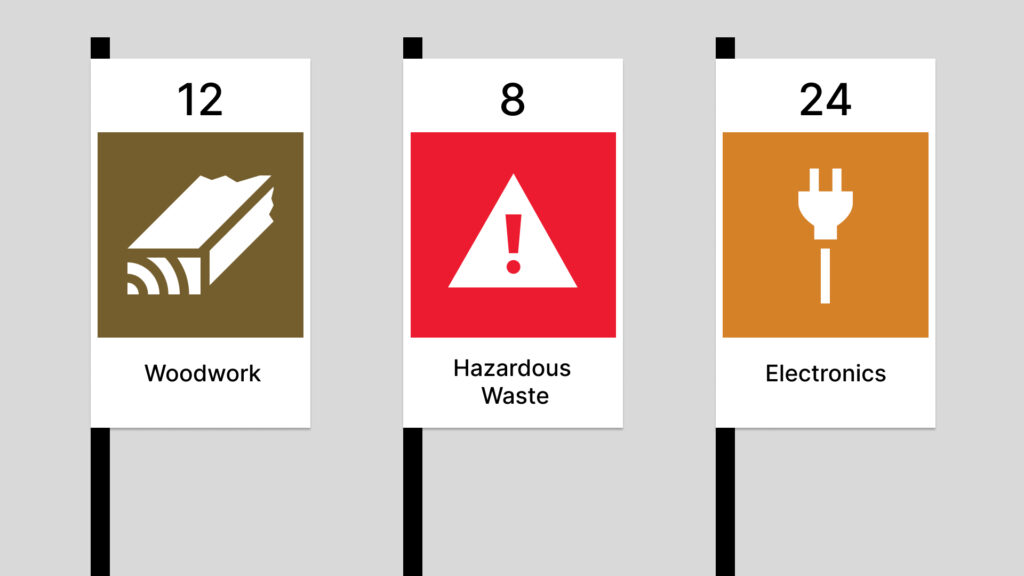
- When numbering signs, place the number above the Sorting Label. We recommend centering the number, as with other elements on the sign.
Size proportions for using the Sorting Labels on vertical signs:
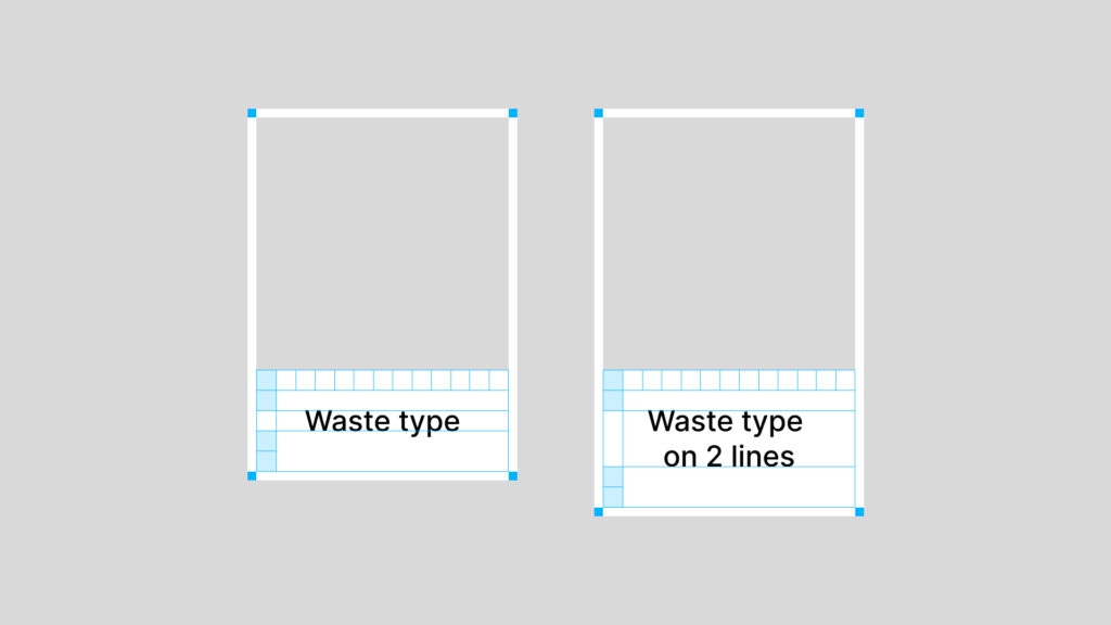
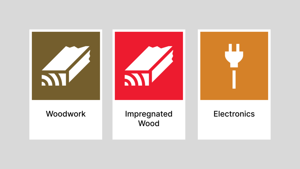
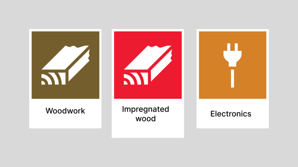
Examples of vertical signs with the same height (recommended solution). The waste type name is top-aligned, and the white field is the same size:
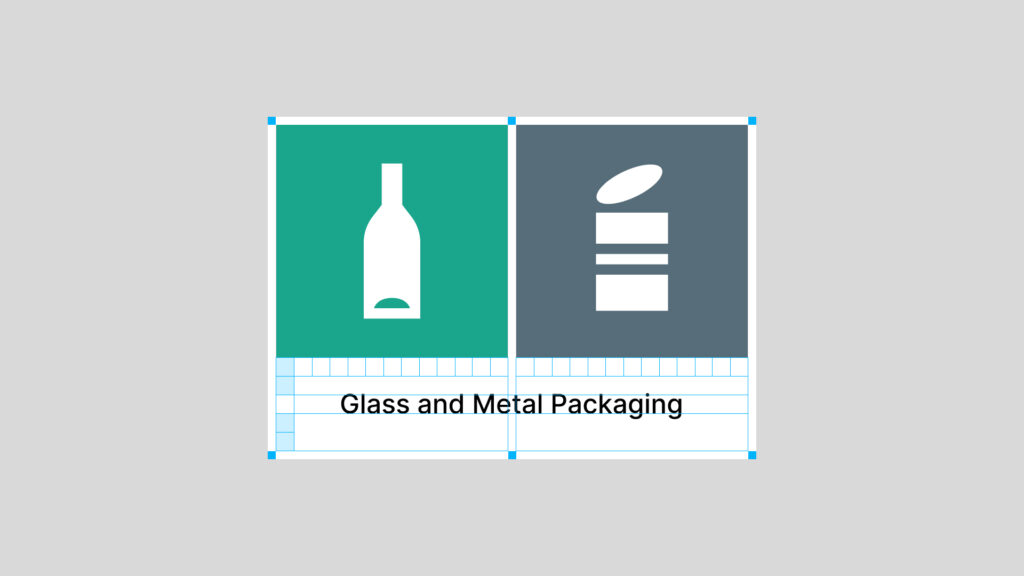
Example of a sign with a combined label for glass and metal packaging:
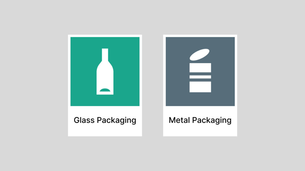
Example of a sign with separate the Sorting Labels for glass packaging and metal packaging:
Example of a vertical sign with multiple languages and the same height:
Example of a vertical sign with a custom logo and the same height:
How to Use the Sorting Labels on Horizontal Signs
The Sorting Labels can be used on horizontal signs, for example, in situations where larger text is needed. To provide the best possible guidance to users and ensure a cohesive overall impression, the following is recommended:
- Use signs of the same width in the same area. The longest waste type name will define the width of the sign.
- Use the same text size on all signs within the same area.
- The name of the waste type should be set in Inter Medium. Translations should be set in Inter Regular with a smaller font size.
- If a logo is included, place it on the right side of the sign.
- Information hierarchy: 1 – Sorting Label, 2 – Waste type name, 3 – Translation, 4 – Logo.
- If arrows are used to assist with navigation, place them all the way to the right.
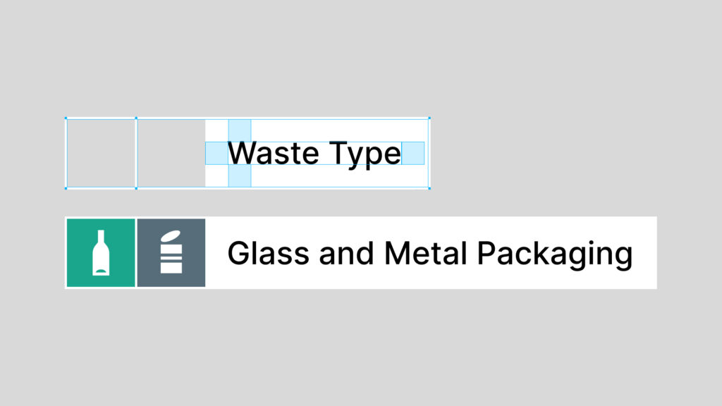
Size Proportions for Using the Sorting Labels on Horizontal Signs:
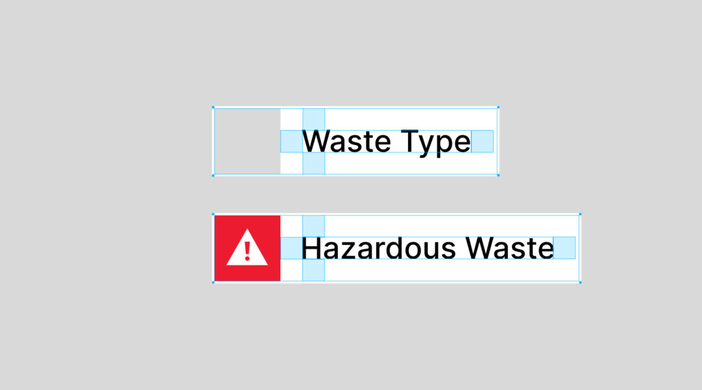
Examples of horizontal signs with the same width. The waste type name is left-aligned to the right of the Sorting Label, and the white space is the same size. The longest waste type name will define the width of the sign.
Example of a horizontal sign with a combination label:
Size proportions for translations on horizontal signs:
Examples of horizontal signs with translations:
Example of logo placement on horizontal signs: